my new logo

Chrisshelton

New member
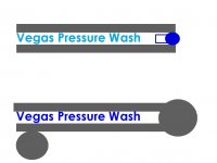
still working on it can't figure out how to make it biger any ideas? let me know what you think.
 
Last edited:
Those colors are kind of bland and it just fades together. Not being an ass but I would do something different. You want to portray a professional image.

Visit Keith at KBK graphics at: http://kbkgraphx.com/

He has done a lot of pressure washing contractors' logos, he made mine too.

Just some options.


_________________
Superior Power Washing<O:p</O:p
Chris Chappell<O:p</O:p
361-853-2513<O:p</O:p
prostaff@superiorpowerwashing.com<O:p</O:p
Exterior House Cleaning Corpus Christi Texas<O:p</O:p
Fleet Washing Corpus Christi Texas
 
Hey Chris, He's going to have to do this one on his own. This is just the first draft.
In 1997 he was 10 years old and he made this logo:

<a href="http://s468.photobucket.com/albums/rr46/sonitx/?action=view&current=LOGONEW1.jpg" target="_blank"><img src="http://i468.photobucket.com/albums/rr46/sonitx/LOGONEW1.jpg" border="0" alt="Photobucket"></a>

It may not look like much, but we used it in the Yellow pages and people know us by it.

We had Vegas Valley Valet Cleaners and Vegas Valley Valet Services.

A valet is a man who takes care of your personal errands. ie dry cleaning, shopping, etc.

Shelly still has it on all her uniforms for the DMV service "Vegas Valley Valet Services".

Now, he will probably use one color in the name. One color is cheaper than trying to use a lot of colors. I've owned a few businesses and too much color can double the cost of uniforms and other promotional items.

I didn't learn my lesson, and made my Sonitx logo too detailed with too much color and now I'm paying the price.

The black dots are my fault. I told him to try to put gum in the dirty concrete. I think that was a mistake. It looked good without the confusion.

And quit being and a$$ :p

Just Joking, thanks Chris, but he can't afford any professional help on this one. He's on a shoestring budget.
 
a nother logos

I made a nother logos what do you think.
 
Last edited:
and another one

one more for the night
 
Last edited:
Great attempts, judging from the logo your dad posted, I fell that something grander is in you brain you just have to coax it out. Keep going.

Find some quiet time, relax and try this (dont laugh :) )

Read the following slowly


Close your eyes..........Take a deep breath...........slowly exhale (do this a couple times),................... relax you mind......................., your remembering fun times when you were ten years old,............... ...... your remembering the passion and excitement you felt when you created your first logo.


(Now on that high, let your creative intelligence flow. Go Chris.)
 
Would'nt it be easier just to fog up?:D

Tony, You may have had this out there for a while and people recognize it , but he did ask what everyone thinks. I think it needs some help.

Justin timberlake started out singing in the Mickey Mouse club, I doubt many folks would take him seriously with a mouse ear hat on today.

Keep the name and try to work with the colors but update it and give a professional flare.

Just my two cents.
 
Last edited:
Maybe if he asks himself...."What is my motivation" like the actors do?

If you are on a budget, what about simple block letters like they use in the Yellow pages ads that are common but pick a little logo like some of the free ones with someone pressure washing?

It can be white with black letters or black with white letters.

Work on it for a while but for right now, just get the name lined out and see how it looks. When you have contrast like that, it gets your attention, especially on yellow pages ads or the local paper ads. Black background with white letters jumps out the most.

Maybe an outline of a guy with a wand and water coming out of the wand, kind of like Ron's logo but DO NOT COPY RON'S LOGO!!!!!!!!

There can be a lot of good ideas there, just let your mind go and write down everything you think of and don't judge as you write or draw, just keep going until you are tired then go over them the next day and then start thinking about them.

Good luck.


<O:p</O:p
_________________
Superior Power Washing<O:p</O:p
Chris Chappell<O:p</O:p
361-853-2513<O:p</O:p
prostaff@superiorpowerwashing.com<O:p</O:p
Exterior House Cleaning Corpus Christi Texas
 
you should put 2 red dice side by side on the backround then the big V over the dice with the egas over the middle of the V, and pressure wash under. that would look cool just my thought. or a poker chip sheild with co.info. good luck went on a mind trip.
 
That's all good advice. Remember, that was his first draft.

About the dice, all that stuff is stuff we do to bring people to Las Vegas.

The last thing a property manager wants shoved in their faces is any reference to gambling or the strip. It has a negative connotation attached to it.

I just went back and looked closer at you guys' logos. In all honesty I remember the names, well enough and I remember the layouts, but I didn't even realize most of you guys have little pressure washing guys in the logo.

Does anybody have any idea what my sonitx logo is? It cost me $800.00. I like it but I just had too much money to blow at that time and went all out.

Many more people recognize that simple Vegas Valley Valet logo. I even had another dry cleaner rip it off and put it on his street sign when I sold my customers. Customers said they liked not having to remember the name of the company and they just scanned the Yellow Pages for that logo.

He's going to keep working on it.

Thanks for the input.
 
That is good to know Tony, I did not know that about the PM's there.

Maybe a plain logo and a great marketing campaign or great service with tons of referrals will be good.

Sometimes the plain but bold names/logos work great, just depends on what he wants to portray as an image of his company.

Good Luck.


_________________
Superior Power Washing<O:p</O:p
Chris Chappell<O:p</O:p
361-853-2513<O:p</O:p
prostaff@superiorpowerwashing.com<O:p</O:p
Exterior House Cleaning Corpus Christi Texas<O:p</O:p
Fleet Washing Corpus Christi Texas
 
any graphic desinger will tell you that certain colors go with a specific type of business. Here a re some basic tips for the cleaning business
White = shows clean, fresh, impecable, profesionionalism. (this is what you do your in the cleaning business, this is the first thing you want to get across)
Blue or Aqua colors =Water,( This shows how you clean or what type of method you use)
Type of letters you use= you should use nice, clean, thin, crisp letters, try to stay away from the bold thick letters.
This is what I have read before on several sights and I am not a graphic designer by any means so hope this info is helpfull

That's good stuff, thanks.

Chris would be answering these posts, but he's out cleaning filters all day.
 
Ok, here's two for ya.

The first one is just a simple prototype of a surface cleaner cleaning concrete that could be dressed up in the future.

The second one is me going one way with a surface cleaner that has a clogged tip (as I have been apt to do in the past) While Chris goes the other way with a good surface cleaner. :D

Something about this one just hits me as properly representative of my son's attitude the first 18 years of his life. I just can't put my finger on it. :p
 

Attachments

  • VPWlogofunny.JPG
    VPWlogofunny.JPG
    51.9 KB · Views: 19
Why dont you try something with a wand, it seems more represntitive of a pressure washer, I have always liked the idea of some kind of a waterblast coming out of one of the letters of your name, kind of making the name and logo into 1, just a thought
 
Back
Top