

You are using an out of date browser. It may not display this or other websites correctly.
You should upgrade or use an alternative browser.
You should upgrade or use an alternative browser.
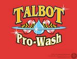
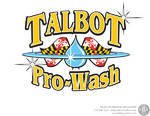
Opinions needed (LOGO DESIGN)
- Thread starter gr8white
- Start date
Palmetto Roof
Member
I like the red!
Ashley Phillips
Moderator
Take the flags off.
That's just my opinion.
That's just my opinion.
Russ Spence
Commercial Pressure Wash Expert
no flags
Larry Millette
Member
I agree. Think it would look real good without the flags.. Nice Job!
cajun cleanin
New member
lose the flags
Scott Thompson
New member
It sounds like the flags may have some meaning for you, but they won't have any meaning to your customers, and therefor no benefit to being there. I think it will look alot cleaner without the flags.
gr8white
New member
It sounds like the flags may have some meaning for you, but they won't have any meaning to your customers, and therefor no benefit to being there. I think it will look alot cleaner without the flags.
Good point. Thanks for the input
Apple Roof Cleaning
Roof Cleaning Instructor
Honestly ?
Start ALL over, and IF you haven't already chosen the name Talbot, ditch that too.
My name is apple roof cleaning, the last two parts of my name help me, the name apple dont do chit.
A better name for me would have been brandon roof cleaning company, or something that tells WHERE you are.
IMHO, your name should both tell where you are, and what you do.
Talbot starts with a T, placing you WAY down in the ads.
Hey, you ASKED ??
David Saulque
Senior Moderator
No Flags
gr8white
New member
Honestly ?
Start ALL over, and IF you haven't already chosen the name Talbot, ditch that too.
My name is apple roof cleaning, the last two parts of my name help me, the name apple dont do chit.
A better name for me would have been brandon roof cleaning company, or something that tells WHERE you are.
IMHO, your name should both tell where you are, and what you do.
Talbot starts with a T, placing you WAY down in the ads.
Hey, you ASKED ??
Yeah, I'm leaning in a whole new direction with the logo now...something without flags,lol. As far as where and who goes "Talbot" is my County and I'm not really worried about add placement even though that does play a part in things. Thanks for the criticism...I take it all constructively
Apple Roof Cleaning
Roof Cleaning Instructor
Oh, MY Bad.Yeah, I'm leaning in a whole new direction with the logo now...something without flags,lol. As far as where and who goes "Talbot" is my County and I'm not really worried about add placement even though that does play a part in things. Thanks for the criticism...I take it all constructively
You ARE doing it right, one of the few
")
Keith from KBK Graphics did a very nice desigh logo for Waynes Exterior Wash!
It is MEMORABLE, it really is, and Wayne is OUT OF BIZZNESS
So I would call Keith, since the Logo is already done, and have him adapt it to YOU
Since wayne has already pair for the set up costs, etc, should be cheap too ?
MY KIND OF LOGO
gr8white
New member
Oh, MY Bad.
You ARE doing it right, one of the few
Keith from KBK Graphics did a very nice desigh logo for Waynes Exterior Wash!
It is MEMORABLE, it really is, and Wayne is OUT OF BIZZNESS
So I would call Keith, since the Logo is already done, and have him adapt it to YOU
Since wayne has already pair for the set up costs, etc, should be cheap too ?
MY KIND OF LOGO
Just checked out Waynes logo and it has one of the two things I told Keith I dont want... A dude holding a wand. But what do I know...I wanted flags,lol.