

You are using an out of date browser. It may not display this or other websites correctly.
You should upgrade or use an alternative browser.
You should upgrade or use an alternative browser.
New Logo
- Thread starter Lenny
- Start date
Mike Hughes
Former Board Administrator
I took care of that, Lenny.
You need to post it in the test area..........then, right click on the image and choose "properties".
Cut and paste the address you find there into your signature file, with the img symbol before it, and the other one after it
put this before the url [-i-m-g-]
and this after it [/i-m-g-]
(leave out the dashes ( - )) I had to put the dashes in this example because the board wouldn't show it without them.
Jon
Member Specialist
Mr. Brown,
Shall I ask you to be nice enough and explain just what looks like a cartoon? Really help Lenny out here if you feel that way so he can evaluate it from your angle and see if it warrants changes.
I personally feel it looks nice, I also know that for a first logo it is a good start, I made very small changes to mine, I belive color mostly.
Beth & Rod
SR Wood Geek / Moderator
Hi John,
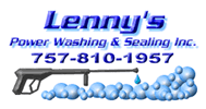
Lenny's logo was modled after a magnet he mailed to me, which had bubbles all around it, and a small power washer in it. We felt this look matched the image he had worked on before.
Cartoons, are memorable. Professional is a matter of opinion. When someone mentions Mr. Clean, you think of the jeanie. Kids like cartoons, adults do too, and one of the largest collectibles is comics. I can't tell you how many times people have commented about our own logo, or name. Besides, when you are competing with with others who have plain logos, a catchy one stands out.
There is a chain of grocery stores around here called Giant Food. I don't know if they have them there or not. They began an online delivery service called Peapod, and the graphic suits the name. When you see the truck it's not something you'll forget.
Good marketing brands your company and helps to make it memorable. People can react strongly to an ad in a positive or a negative way, but the interesting thing is, that we remember the negative ones too, and many of them do quite well. (Itry to creat positive logos) Take the guy who screams at the TV wearing the suite with question marks and selling his book.... how many have seen that ad and know which one I am talking about? The one for info on Government money? You may not like it but it's memorable....
Beth
Hi all
Good job.
I do have a couple of questions.
Number one,we are all in the buissness of pressure washing. We work with the tool's of the trade everyday.
Now take your average 50 year old homeowner or 20 year old homeowner and show them a pic of the gun and wand. Do they even know what it is or how it relates to pressure washing?
For that matter dose a average 50 year old even know what pressure washing is.
Then if they do know what pressure washing is do they relate that to doing work on there own home,or do they think of commerical work?
Lastly my opinion.
It is a good logo but i would never letter my rig that way. Your co. name should be secondary to what you do. Not your name bigger then your service. You need to get intrest in your service before they need or care who you are.
It is way diffrent if you have spent millions on advertising. Then a logo is worth millions.
Whatever your target customer may be is what you need to put in the biggest boldest print. Then make it simple and easy to read as with the phone number. Then get fancy with your co. name but professional.
people 4 houses away wont go out to walk the dog to look at your rig. They sometimes dont know the next homeowner or want to talk to them so your rig must be set-up so drive-bys,walk-bys,lookers,and drivers can get 3 pieces of information in 3 sec. and remember it.
As with BETH'S logo it relates to her service,her co name,and appeals to all age groups.
She has a winner. Now even if someone missed the phone number but remembers the cartoon. I assume her phone book ad has the cartoon in her ad.
Very smart.
Dirt running-why would dirt run[because they are cleaners] Why would you remember her co name?[because of the cartoon] What was the phone number?[i'll look in the phone book] "i see it, the little dirt specks running"
this is the sole purpous of a LOGO.
THE WAND THING JUST WONT WORK BECAUSE EVERY AD HAS IT IN THERE. BUBBLES OR NO BUBBLES. SPRAY OR NO SPRAY,DRIP OR NO DRIP. BY ITSELF OR WITH SOMEONE HOLDING IT-----------WOW,SOMEONE HOLDING IT OR BETTER YET SOME "THING" HOLDING IT[HINT HINT]
I am only trying to be helpfull, i do like the logo.
i wish i could use the "monster" from bugs bunny.
The red haired big guy with white sneakers.
Your logo should be on everything that you advertise,print,send out,pay by check,buissness cards,everything!
Beth & Rod
SR Wood Geek / Moderator
Hi Ron,
I see your points. Here's the dilema... what would you advise if someone has an established business and the name is a personal name, and doesn't lend itself to a particular image to go with it? What if renaming the company in order to do what you're saying isn't an option?
Lenny had his name and the word power next to each other to start with, which allowed for washing & sealing to be larger beneath it. But, it was changed along the way. (changing it back is easy) For signage I would drop the shadow effect and send a new file to him so it is easier to read.
If he's well established in his area, then it could work just fine especially if the area is not overly congested. (Not a major city)
I can see what we can do to come up with a character if he wants one. No problem. Like I said, it was all based upon his magnet, and the image he seemed to have begun for himself. If he's not tied to it and want's to change, that's fine. Personally, I like the bubbles. It's a change of pace from water.
Could come up with a little man with cleaning tools or something to go next to the pile of bubbles...
Beth
I see your points. Here's the dilema... what would you advise if someone has an established business and the name is a personal name, and doesn't lend itself to a particular image to go with it? What if renaming the company in order to do what you're saying isn't an option?
Lenny had his name and the word power next to each other to start with, which allowed for washing & sealing to be larger beneath it. But, it was changed along the way. (changing it back is easy) For signage I would drop the shadow effect and send a new file to him so it is easier to read.
If he's well established in his area, then it could work just fine especially if the area is not overly congested. (Not a major city)
I can see what we can do to come up with a character if he wants one. No problem. Like I said, it was all based upon his magnet, and the image he seemed to have begun for himself. If he's not tied to it and want's to change, that's fine.
Personally, I like the bubbles. It's a change of pace from water. Could come up with a little man with cleaning tools or something to go next to the pile of bubbles...
Beth
good point
if everyone knows you by your name then fine. If your looking to get bigger,find new customers,exspand your market, then adding something catchy might not be bad.
This has nothing to do about the bubbles. I like them. I just think the whole wand thing is overdone.
What is your opinion on my first statement about" if reg people even know what a wand is or what it's for?"
if i could afford it i would letter my rig so that it was covered in bubbles and the wand was washing them away and underneath the bubbles was my co. name.
Soap=clean [scrubbing bubbles] people allready have an idea what your all about. It reflects another co's idea and they spend millions on advertising.
That is not a bad thing.
If the winter would end soon i could get some money and let you print one for me.
Beth & Rod
SR Wood Geek / Moderator
Exactly! I got as close to the scrubbing bubbles as I could... animating a bubble is possible, but you have to be careful. I tend to stay cautious where that's concerned.
If everyone is using a wand, then it should be recognizable. If no one is, then it won't be. I can go either way on it. It's a matter of personal taste.
Beth
If everyone is using a wand, then it should be recognizable. If no one is, then it won't be. I can go either way on it. It's a matter of personal taste.
Beth
Clean County PW
Active member
I think the wand works in the logo which is the reason I have it in my logo. I also believe that the name of the company should be displayed large enough on your business cards, Estimate sheets and Rigs so people will recorgnize your name as your business grows.
Logo's can be extremely important because they go hand in hand with name recognition. Cartoon logo's also work. If I had more money I would also like to have a Muscle head man hold the wand in my logo but I can see where this could get pretty expensive for when I have my Truck/rig lettered.
My Logo was designed by Wanda here who used to frequent this board.
ron p
a point out of your post ron...
It is a good logo but i would never letter my rig that way. Your co. name should be secondary to what you do. Not your name bigger then your service. You need to get intrest in your service before they need or care who you are.
i think your rig should be lettered different(on a tank) than on your logo or any paperwork for you buiness.
it should be your name.......phone number........web site..
all the same size..as big as you can get on your rig(tank).
put your services on the doors or tailboard\ramps.
now if you have a enclosed trailor thats another........
cheers paul.
Thanks for all of the input about my logo.
I like what Beth has done with it and my new web site. I think when someone sees your logo they will be looking at a web site, flyer, or something else up close, so they will have no trouble seeing the power washing and sealing under the name. I wanted it to be on the same line. I did not think of that until after I received the magnets I sent Beth. About the wand, I was concerned about it looking too much like an uzi so I had her put the drop of water under the end, it helped a little. I like her idea about having a man scrubbing the bubbles.
As for putting this on my rig, I was thinking about it but I understand what you all are saying. I think the company name is as importing as what they do, so they both should be equel in size. You also have to be careful not to put to much on the rig that a potential customer might not be able to read it all and miss the phone number. I got my bigest customer because they saw me go by with magnetic signs on my truck and jotted down the phone number. I have seen trucks with signs that almost give the company history on them.