You are using an out of date browser. It may not display this or other websites correctly.
You should upgrade or use an alternative browser.
You should upgrade or use an alternative browser.
Logos
- Thread starter danwagner
- Start date
mistersqueegee
New member
View attachment 27089Lots of logos can look the same. I dont see why a similar look is so offensive.
John the Carrier and Ford logos speak volumes in this case.
Hi Dave, be glad to give you or anyone that asks me an explanation. I have had a few people call and text me today, and have been glad to take the time and explain. Anyone that calls and ask me anything I am always willing to share.
First off, I am not looking for a logo that is similar to PWRA or anyone else for that matter. That is not even a consideration. Derrell and I have, along with my wife and Office Manager, (A/K/A the committee) been working for the past 6 months or so on trying to come with something that A) we like, B) can be embroidered on Golf Shirts and still be visible, and C) get the message across of what all I teach. WE originally had been going with the Doug Ruckers Pressure Cleaning SChool-but I did not like the fact that it left out Soft Washing and Roof Cleaning as well. While doing some recordings the other day, for my new web based school, I mentioned to my Office Manager that I wish the logo had the words, Power Wash, Soft Washing, Roof Cleaning, and then just maybe put Doug Rucker's School in the middle. She said, why not put Doug Ruckers School in the middle and have the words Soft Washing Roof Cleaning Power Washing wrap around the oval part. The oval part is something we always wanted from the beginning, and is very generic, millions of oval logos out there, and we figured we could have patches made up for guys to put on a jacket or hat if they wanted. So, I emailed to Derrell that concept, of changing the existing Oval that we were using, and he emailed several back.
By the time I got the samples back from Derrell, the committee had left the office for the day. So I saved them to my phone and began texting them to them, all the while Derrell kept tweaking and sending me more samples. One of them I sent to the committe. got a return reply of EWWWW, (the red one) (don't tell Derrell, my wife and Emma Grace love his work and don't want to hurt his feelings) one got an I Like (the green one), and the blue and the Blue/Gold both got "thats It" replies. I personally liked the one I posted on Facebook, and posted it on my personal page, UAMCC Group Page, as well as my School Facebook page and Pressure Washing Friends Page. I never even noticed any similarity nor was PWRA even ever thought about in the whole process, much less my life...lol. And I can assure that neither members of the committee have ever heard of PWRA.
The logo I posted is still not the final one, it was simply posted to get reaction from family and friends and colleagues, just like all the others have been. But it also may be chosen as the final one. Once the Committee can make up their mind and bring me the final ones they choose, I will be the ultimate tie breaker on it. If it is similar to PWRA, or anything else that is out there, I will look at the bridge when it is time to cross it.
Derrel has always been great to work with, I find his fees very reasonable, and he responds quickly with our pesky little changes, so I am in no hurry. One they decide, we'll move on. Until then, I may continue to use this one, I may not. Today, the committee mentioned they are leaning towards the green one because it goes with the "Clean and Green Solutions" name.
The Fellas at the PWRA can continue to make assumptions and accusations without so much as asking me, if they so choose. I guess it's just my turn. Doesn't bother me. I grew up the son of a Southern Baptist Minister, so it's very hard to offend me. As I told someone on the phone awhile ago, "this to shall pass"
I'll post the other samples in another post from my phone. Any input you or others would like to offer, I am, or the committee, will be all ears.. I'll be glad to pass it along.
Thanks for asking, and hope this helps.
thanks for answering Doug
danwagner
Member
I think the eyebrows get raised when it's in the same industry. Granted, there are recurring themes in logos it seems. But I personally don't want mine to be identified or compared to a competitor's at all if possible.
So what do you guys think is more important. Quick recognition or service or experience association when presenting a logo?
So what do you guys think is more important. Quick recognition or service or experience association when presenting a logo?
"Red"
Graphic Designer
In my opinion, quick recognition is what you want for new customers, if they recognize your logo then great. Service/experience will be for current or previous customers, they aren't going to call based on logo recognition, but rather the reputation (hopefully a good one). I don't see how a logo would mean anything to anyone if the logo doesn't express a certain message. I've seen literally hundreds of logos that I couldn't figure out what service they provided or product the offered. The logo should suggest enough so that it will attract new customers. 5 second rule applies.
WASH-IT H.B.
New member
Couldn’t agree more. 5 second rule. Like it. Never heard of that before. That’s where I am coming from. Maybe a pictorial logo may offer some suggestion as to the service that is being offered if the company name doesn’t reflect the service well. At the end of the day it’s what works for you. I was looking to keep my company name simple and easy to remember and reflect the service I offer. Had many customers comment on my business name and had the thumbs up from them with regard to how easy it was to remember and that it was obvious at first glance what service I was offering.In my opinion, quick recognition is what you want for new customers, if they recognize your logo then great. Service/experience will be for current or previous customers, they aren't going to call based on logo recognition, but rather the reputation (hopefully a good one). I don't see how a logo would mean anything to anyone if the logo doesn't express a certain message. I've seen literally hundreds of logos that I couldn't figure out what service they provided or product the offered. The logo should suggest enough so that it will attract new customers. 5 second rule applies.
WASH-IT H.B.
New member
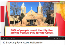
I made a point RE:THE GOLDEN ARCHES Check this out. I rest my case. http://youtu.be/Cbf_pmT6duA
Attachments
Art Oliveri
Roundtable Host 2009
I like the one to the right with the power washing guy
Doug Rucker
Roundtable Host 2009
Doug, Whatever one you choose would make a great belt buckle too!
LOL....that's greet...never thought of that.
Doug Rucker
Roundtable Host 2009
I like the one to the right with the power washing guy
Me too...but won't work for embroidery
revive coatings
New member
john neilson
Roundtable Host 2009
I like it.


