

You are using an out of date browser. It may not display this or other websites correctly.
You should upgrade or use an alternative browser.
You should upgrade or use an alternative browser.
logo design, what do you think?
- Thread starter trqjnky
- Start date
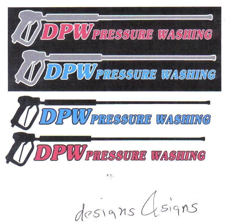
I dont like it, but its a start.
I hope you wanted my real thoughts, very dull. The colors need to be more vibrant.
I hope you wanted my real thoughts, very dull. The colors need to be more vibrant.
I dont like it, but its a start.
I hope you wanted my real thoughts, very dull. The colors need to be more vibrant.
i can used any color i want. what would you suggest?
i can used any color i want. what would you suggest?
The colors are fine, they just look dull
Window Washing PRO
New member
Looks dull because it a printed sheet and then scanned, that's my guess.
Once you ink the tshirts color would look different.
Once you ink the tshirts color would look different.
XSTREAM H2O
New member
Ill make you that same logo for half his price!!! :grin-devilish:
Scott Stone
New member
Yawn...By the way I paid $75 for my logo, below.
joshuabcrutcher
Member
I'm glad the guys are honest - it would only help to lay it out there... I have to agree - my first thought was that it looked "dated". I am no logo designer, but I put this together in a few minutes. I don't know what your market focus is but you need something that looks professional.
Attachments

joshuabcrutcher
Member


Mike V
Member
Josh is onto something...and knowing what your focus is the key.
Branding is paramount and you want something that people will remember. You logo should clearly indicate who you are and what you do. It should not be difficult to read, spell, or remember. It should e eye catching but not overbearing.
The design with the wand is cliche' and dated.
Branding is paramount and you want something that people will remember. You logo should clearly indicate who you are and what you do. It should not be difficult to read, spell, or remember. It should e eye catching but not overbearing.
The design with the wand is cliche' and dated.