The latest LOGO...

kbkgraphx

New member
Hello everyone!

Attached is the latest logo I've done for a pressure washing company out of Texas. As always, I worked right along with them helping to bring their vision to life.

If you are in need of a logo or ad feel free to email me or call me. I look forward to creating your business identity at an affordable cost!
 

Attachments

  • woweelogocolorfinalsmall.jpg
    woweelogocolorfinalsmall.jpg
    88.3 KB · Views: 194
The Arms Dispute....

Restoredeck:

I guess I see what you mean, but then again, his arms are each in a totally different position. One is angled sideways, while the other comes toward you. Good eye though! You should be an art director! LOL

PS: You are the first to notice, so I won't sweat it too much.
 
Last edited:
kbkgraphx

I wouldn't sweat it at all, I just notice things like that because I design a lot of different things for my biz like flyers, cards, web site: www.RestoredDeck.com , even a brochure on deck and fence restoration and so I guess I have developed a good eye for that sort of thing over the last 5 years.:D
 
Arms

He is a cartoon charactor for cryn' out loud! His proportions need to be exagerated. Makes it more interesting. Otherwise it would be boring. Its not Photo Realism! Great Logo ! And very eye catching. Keep up the good work. Dont sweat the critics.
 
Critics make us all try harder!

As long as it is constructive criticism, bring it on! I value the opinions of everyone who sees my work, whether bad or good, because everyone sees things in different ways.

EXAMPLE: "Star Wars" is perceived as an epic movie by some, while others see it as silly fantasy.

But those who can see both qualities in it are the smart ones!
 
I think the logo looks great. Funny thing is that the one who notices something wrong is the one who steals other peoples Ideas and steals other peoples exact images and even pics of other peoples employees doing work and claiming it to be their own. Not until he got called on it did he finally remove it from his page. Not trying to be an a$$ here but maybe when you do the critisizing (spelled wrong) you should look in the mirror first.
Don't throw stones when you live in a glass house my man.
 
I like the way you did the high pressure hose!

can you do a logo with a guy that has blood shot eyes , dirt from head to toe and his butt dragging the ground . lol.............

because that is the way i have felt the pass few days!:D

Mel
 
Extreme:
As I have already explained I thought I had permission to use that process page! :mad:

Everyone:
For toughs how don't know my ex- business partner had told me that he had designed the process page that Extreme is talking about. And Extreme called me on it and I removed it the same day. End of story!

Also as far the criticizing (spelled right) goes I like the logo just thought the arms looked a little funny but that is just me, one opinion of many.
 
Arms and the man!

RestoredDeck:

While I don't mind criticism, the cartoon character does. Watch out for those diferent-sized pythons. LOL

Everyone have a great Mother's Day!
 
my 2 cents

Everyone is focused on the arms.

Let me ask you this - If you do not know anything about pressure washing - What does the logo tell you as a customer?

What do you think, when you see a sun visor?

Where does your eye focus on as you pass down the road (yard sign) - What do you remember the next day? Do you remember the name, picture, or what?

Don't get me wrong - I like the logo, just food for thought.
 
Food for thought....

BUT I'M STILL HUNGRY!!

A logo should function as a whole, not in pieces.

While it is very true that there should be an element of the logo that triggers an involuntary recognition, that doesn't mean the rest of the logo should be sacrificed for that one element.

In the WOWEE logo, I believe the swirl in the "o" would be the subconscious trigger element. But, for other people it may be the guy, or the way "pressure washing" is staggered.

Anyways, with all this talk about male arms I'm beginning to wonder what forum I'm really on! LOL


TIM: If I didn't know you were a pressure washer, I might think that you were a surfboard manufacturer. Not that I don't like your logo, just sayin' is all.
 
Maybe I should expand my business into building surf boards, boats, beach equipment, sun screen, swimming pools, etc. haha


One thing for sure - When you go to the phone book and see my display, you will be familiar with my logo - if you have seen it before.


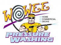
Look around - how many logos do you see with muscle men holding a wand. Originality creates familiarity.


Theres a thousand ways to inform customers of your business. You can do it by text or pictures. The key is to attract the customers eye and for the customer to become familiar with your logo.

In the past, I have went in detail in the thought process behind my logo - so I won't now.

I did not mean to offend you in any way - like I said before, there are a lot of theorys on logos, advertisement, etc. I have design logos in the past, but do not have time to mess with it. I'm a Business Consultant - I go into business and evaluate everything from their financial process to their marketing process. Thats what I do - I increase their sales by 20 - 50 percent within a 12 month period. I'm not an expert in specifically logo. I don't have an graphics arts background like you - so you are the expert in graphic designs. I have a financial/accounting and marketing background - I help people start and save businesses for a living. I'm a part-time accountant for a university and own several businesses myself. You are the expert in graphics design and you do good work - so please don't be offended - I just think the arms are trivia - its the message that logo is sending. Like you said - I could be a surfboard manufacuter. I see your point, Thank goodness, that I live in the southeast Missouri. People around here probably thinks its a bait and tackle shop. haha One thing for sure - within 1yr, TIDALWAVE is the largest pressure washing business in this area and is about to open offices in St. Louis and Memphis within the next 6 months.

You do good work - look forward to seeing more.
 
Last edited:
No Offense Taken!

No, no, I was not offended in the least! Let's not go that route!

I do logos per a client's specific (or not so specific) instructions. I try to take their base ideas and change it into something all the more exciting.

While currently I am a graphic designer, I also really love the marketing angle of it all, too. Y'know, coming up with catch phrases and concepts that really work.

As far as the muscle men with wands, so far that is what people have wanted. I tell my clients I can do anything they can dream up, but the friendly tough guy has been the prevailing element in the logos I've done for Pressure Washng companies.

Also, it is obvious to me that you know what you're doing. Especially after our discussions on the "Sales & Marketing" board.

As for your logo, it is definitely very nice. Very corporate and professional. Once the service is understood, it makes it all the more appealling.

As for more logos, I think the Pressure Washers must be so busy working right now, they don't have time to think about image.
(Either that or people hate the muscle-men)
 
Hello everyone!

Attached is the latest logo I've done for a pressure washing company out of Texas. As always, I worked right along with them helping to bring their vision to life.

If you are in need of a logo or ad feel free to email me or call me. I look forward to creating your business identity at an affordable cost!


Another nice pressure washing LOGO
 
Back
Top