Logo Opinions

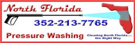
Ok, figured it out. Made a few other changes, added a slogan that someone else in the business in another state used to use, and gave me permission to use if I liked (though I am not sure if I will stick with this one.)

I changed the color of the Florida graphic to match the rest of the red graphics. It was kind of orange/red. The color of the spray still seems a bit off, but I can't seem to find a darker blue that looks right (yet).

Suggestions?

Should the color in the slogan be a different color than the phone number? I'm trying to stick with red, white, blue, and black.
 

Attachments

  • logojpeg4.jpg
    logojpeg4.jpg
    83.1 KB · Views: 82
Color Chart

Hi Mike, have a look. Your logo looks great. Did the Layer tip help you?
 
Hi Mike, yea that'a good chart. If you click on the Link next to the color it will fill the page with that color. If you use the colors with the letters and numbers drag your mouse over it to highlight, then right click on it and choose copy. You will be able to paste it in your programs color selection.

I mostly use Paint Shop Pro.

I see you are in Gainsville, I did pressure cleaning in the Ocala/Bellview area about 14 years ago, back in the "sink hole days".
 
Ocala will be a part of my intended market, though not one I'll likely hit with much more than a phone book ad or an ad in the paper, though there ARE a LOT of new, huge subdivisions down there. If you haven't been down there in a few years, you'll be amazed at how it has, and is, growing.

Bellvue is a bit too far unless it was a fairly big job.
 
Oneness

I like the first one with the slogan under the state.


Looks Great


Oneness - What do you think?
 
Last edited:
I'm leaning toward the second one

With your title and sub title at the top


it look better and better as I look at it.
 
I like the one time stamped 11:35. I think it is the first one of the two most recent. :)
Beth
 
Mike, let me do you a favor...

Mike,

I saw your logo you posted. As an artist I must say it just doesn't do the trick. What is the main focus here? Florida or Pressure Washing? All the effects on the type are going to make for very costly printing as well.

Attached you will find an example of a logo I did recently. Obviously, this logo is not for you, but you do need something CLEAN & STRIKING like this.

If you're interested in what I can do for you, email me anytime!
I look forward to hearing from you.
 

Attachments

  • extremelogo-redblack3.jpg
    extremelogo-redblack3.jpg
    97.1 KB · Views: 94
kb:

While I appreciate the offer, I think I'm going to stick with what I've got, plus any modifications I think will make it better.

As far as printing cost, the logo is intended for four purposes, those being business cards, advertising (such as postcards, door hangers, fliers, etc), a website, and rig lettering. As I understand it, the first two should be affected by whether I use my logo or a "cleaner" one you might create. The place I intend to have print my cards and advertisements is twigonestop, and they advertise full color printing at very reasonable rates. The way I understand it is that I provide them with a file in a format they can use, and they print it full color. Beth, who I beleive has used them, may be able to either corroborate this or refute it. The website I will be doing myself, and will not be affected by the style of logo one way or another.

As far as the main focus, it is both North Florida AND pressure washing. It brings into focus both the service provided and the area that service is located.

I'm not looking for a new logo, nor someone else to do it for me, but if you have any suggestions to offer regarding what I do have, I'd appreciate those.

Thanks!
 
oneness,

Just found out I will be going to gainesville for Christmas to see the grandson. Hope you will be there, maybe I can treat ya to a beer or two?

Reed
 
Logo tips for ONENESS...

Oneness,

Well, to start off I would say that the PHONE # & MOTTO need not be included in your logo. Those elements should come after the logo.

I think if you incorporated North Florida, Pressure Washing and the Gun into one solid design (possibly circular), the Phone # and the Motto could be place below or beside the logo more effectively. Just a thought...

Enjoy the rest of your weekend!
 
I like the final product - One thing about logos or marketing/advertisement, there are a lot of different theorys.

oneness - you are on the right track.
 
My opinion. I like it. But you have to put on the shoes of your potential audience. Are you designing a logo to have a fancy logo or to simply get noticed easily? Keeping it simple is something I'm a firm believer in.

However you decide to make it, the less noise there is, the more effective the advertising will be.

Tim... (tidlewave) I like your logo too but the first thing I see is the tidle wave and in passing I would have to look too hard to see power washing. I also disagree with the term, "powerwashing" We wash with high pressure water. We don't wash with power. The president has power, electricity has power. Pressure washers utilize pressure and water. A pump is measured in terms of pressure, not power. I'm of course arguing the semantics of it but just think about it for one moment...

... Every time I see the term power washing, it kinda irritates me because it's not power your turn up or increase, it's pressure. We have pressure washers that have pumps that pump water at high pressure. Not power.

Here is a pic of my simple advertising you can see and read from a long ways...

This is my opinion and nothing else.
 

Attachments

  • sign 046.jpg
    sign 046.jpg
    18.9 KB · Views: 78
Justin

powerwashing - I agree 100% I have change that on my logo over a year ago. I couldn't get this board to accept my disc with the new version.


As of the first thing you see being the tidalwave (water) - thats awesome - thats my goal. The purpose of a logo is for the customer to be able to recognize (familiar) you company without reading.

My goal with my logo - When your passing by in your car and you see a yard sign: I want you to focus in on the water (tidalwave) and I want your eyes to follow the flow of the water right into the name of my business - which is TIDALWAVE.

When a potential buyer goes to the yellow pages and can not seem to remember the name of that sign they saw - they will remember the picture. Statistics shows that a customer is 63% more likely to remember a picture (logo) than a title of a business.


Justin - let me ask you a question, Now that you have seen my logo several times - if you seen it without any words - would you recognize it.


**As of logo being simple - no way - you have to catch the eye of the customer.


ps I like your logo - its sharp.
 
I agree with you Kieth 100%. Clean and striking. I'll post mine as soon as I get it done its simple but effective.

Most print shops want it in EPS format so it can be easily sized and printed or embroidered. The overdone cartoon type logos are not versitile enough for hats and shirts. Underwear maybe.
 
Back
Top