I love it!!!

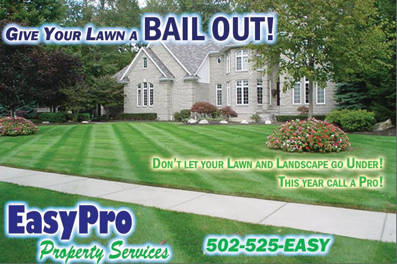
Look great DJ, the glow on text really helps... are you using photoshop? I use corel draw and like things like drop shadows and 'glow'.
I would nudge your logo on the front side up from the bottom and in from the side by the same amount - so that the margins are the same. By doing this it would allow you to align your telephone number and the bottom of the logo. In my opinion it would help 'the look and feel'. Also, perhaps make your telephone number a bit bigger.
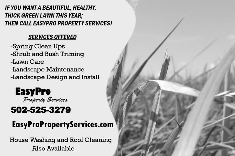
On the back side I would change your top tag line to, "IF YOU WANT A BEAUTIFUL, HEALTHY, THICK GREEN LAWN THIS YEAR... CALL EASYPRO PROPERTY SERVICES!"
Under 'Services Offered', there should be two 'M's' in trimming.
Might be an idea to put your House Washing and Roof Cleaning Also Available statement under your Services offered section... not 'bulleted', just keep the statement. Underneath that I would center your logo, tel. no. (bigger) and website address... might help with the 'flow'.
I think it is a great looking postcard with a relevant and catchy message... nice work DJ!
Hope some of my advice helps...

