

You are using an out of date browser. It may not display this or other websites correctly.
You should upgrade or use an alternative browser.
You should upgrade or use an alternative browser.
logos 10/24/01
- Thread starter Ron Musgraves
- Start date


Jon
Member Specialist
I still don't like the black backgound for some reason Ron, it does it no good.
Also put some color in the letters like the yellow you had before.
You want to stand out and everyone uses black. Even my trailer sign is goldenrod on black but it stands out. The goldenrod shows up at night really good.
Also put some color in the letters like the yellow you had before.
You want to stand out and everyone uses black. Even my trailer sign is goldenrod on black but it stands out. The goldenrod shows up at night really good.

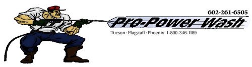
jsut showing off my logo fro home page
Ron,
I like your Pro Power Wash logo, wish I could draw graphics like that. I can't even draw flys.....lol
As for the board logo, I bet you'll be pulling your hair out before you come up with one that everyone agrees on. Trying to do anything by committee is almost impossible at best.
Now my 2 cents...
I agree with Jon. I think the white background looks better. The large yellow text stand out well also, however the small yellow letters against the white background gets kinda washed out and makes it hard to read, as did the small dark blue letters against the black. On the white background, a darker color, maybe red, would stand out better and make it easier to read. Just my opinion.
Maybe it would be less frustrating for you, if you come up with several you like and the members can decide from those choices. Otherwise you may be chasing your tail for a while.
Your doing a great job.......but remember you cant please all the people all the time...This will still be a great board whether everyone agrees on the logo or not.
Power Clean of America
Member
Tuff dude he is.... looks good ron.
i also like the
PWN improving our industry through teamwork
Pressurewashing Network
needs a border though....
roy
i also like the
PWN improving our industry through teamwork
Pressurewashing Network
needs a border though....
roy
Last edited:
Ron,
I got bored last night and started playing. What about something along this style?
The text spacing isn't the greatest on mine and it needs to have the hose replaced, looks like it's been run over a few times. I know you could make it look a lot better than I did.
Now, let see if I have any luck attaching the jpg.....