

You are using an out of date browser. It may not display this or other websites correctly.
You should upgrade or use an alternative browser.
You should upgrade or use an alternative browser.
logo help
- Thread starter Lou Zehnder
- Start date
Matthew Norman
Moderator
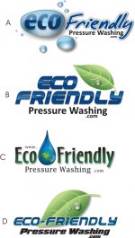
I like logo D the best. Logo A is a close second.
Russ Johnson
Equipment Expert
If the name of the site is eco(dash)friendly.com, "D" is the only logo that truly conveys that.
Christopher
Moderator
Those all are nice. If the letters in B were thinner or another font so they are easier to read, I would go with B.
hi-temp hydro
New member
Modify C and you've got a winner.
Take the drop with the globe and make it the "O" in Eco.
I use this same principle in my logo and it has served me well.
Best of luck which ever you choose.
Take the drop with the globe and make it the "O" in Eco.
I use this same principle in my logo and it has served me well.
Best of luck which ever you choose.
howarddoug
New member
I like B the best.
NJWashingGuy
New member
C, its all about saving the earth.......:angel:
Terry Mullins
New member
Personally, I like all of those logo's.
I suggest that you insist on getting your logo sent to you in a vectored format so that it can be professionally duplicated on business cards, web sites (modified, of course), and many other promotional materials.
If you open up your logo & magnify it over and over again and it starts to look grainy, then it's a rastored graphic and you will have to pay someone to convert it into a vectored graphic before it can be professionally replicated.
Lou Zehnder
New member
Terry
I know he is doing this in coral. I also have coral .......What file do i need to ask for to change things....]
Lou
I know he is doing this in coral. I also have coral .......What file do i need to ask for to change things....]
Lou
Terry Mullins
New member
Terry
I know he is doing this in coral. I also have coral .......What file do i need to ask for to change things....]
Lou
As I understand it, someone correct me if I am mistaken, a file saved in coral draw ( recent versions ), can be saved in a vectored format. If they can save / export it in a AI, or SVG or PDF format, these formats are what professional companies are looking for.
A simple way of determining if your file format is vectored, it to open the file and click on your magnifying icon and magnify it ( zooming in on the graphic )... if the graphic becomes grainy, ( doesn't look sharp ), then it is rastored and not vectored, which is the preferred format you are looking for.
Larry Millette
Member
I like C but using the Font size of B. I'de still go with the green just bold it up.
jsatterfield34
New member
Lou, most programs like Coral, Photoshop, Illustrator can open vector files such as .EPS. You want to ask for the file that allows you to manipulate the layers. You logo is made up of different layers.
Also, I like logo D. The leaf portrays that you are a GREEN company, and the wet look says that you work with water. I like it.
Also, I like logo D. The leaf portrays that you are a GREEN company, and the wet look says that you work with water. I like it.